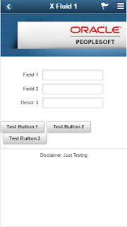
While PeopleSoft fluid or generally known as "Responsive Design" may be new to some but not to others, I thought I would share a little simple trick to get your custom fluid page to render correctly on a small form factor device, such as smart phone.
Building a fluid page needs a little bit of getting used to, but by far it is still a lot easier than building a responsive design web page from scratch. Thanks to PeopleTools for this handy tool, we can now build a "responsive design" page in minutes not hours.
After you built a "Hello World" fluid page from scratch, tested it on the browser, and everything looked good initially, you would think "WOW, I did it and woohoo!".
Sorry to pop your bubble, I will say don't get excited too fast. You are not done testing. Remember! why are you building a fluid page? What devices that most of your users will access your fluid page from?
One of the main reasons why you start building more fluid pages than classic nowadays is because you heard this phrase a lot "
Think Mobile First".
So back to your testing exercise, browser testing is not enough, you need to test this in your mobile phone for a small form factor. If it looks good, then you can congratulate yourself and move on.
How do I know if it looks good or not? See my examples below:
The one on the left looks great and this is what you are hoping to see on your mobile phone too.
So, you start asking yourself, WHY?
Two screenshots below were captured from two fluid page source code. One on the left is good, one on the right is NOT.
Here is a solution for you. Go to the app designer and add these two lines of code in your page activate peoplecode.
Retest your new page now on your mobile phone. Congratulations! your page renders correctly.
Don't Forget...Think Mobile First!
Happy Coding...


