Showing posts with label Responsive. Show all posts

Friday, July 6, 2018

PeopleSoft Spotlight Series: Developing Fluid Applications


The PeopleSoft Spotlight Series is a video-based learning resource that helps you get a deeper understanding of our latest Oracle PeopleSoft technologies, features and enhancements.

This video discusses the following topics:

  • Fluid User Interface Overview 
  • Understanding Fluid Application Development 
  • Creating Fluid Pages 
  • Creating and Registering Fluid Components 
  • Touching Up Fluid Applications 
  • Additional Resources
New in this version are a comparison of fluid to classic and classic plus, updates to the Fluid tab, how to specify values in the component Registration Wizard, setting a default viewport, and the smart phone icon on the Add Tile dialog box.


Monday, November 7, 2016

Why My Static Image On PeopleSoft Fluid Page Is Not Responsive?

Howdy Coders!

Have you tried adding a static image on the fluid page and noticed that your image was not responsive to a small form factor device?

If you have that problem, read on...

So, I added a static image to the fluid page (For sample purposes, I am just using the header logo from Sign In page), That's the easy part!


Save the page, and test it on a browser.

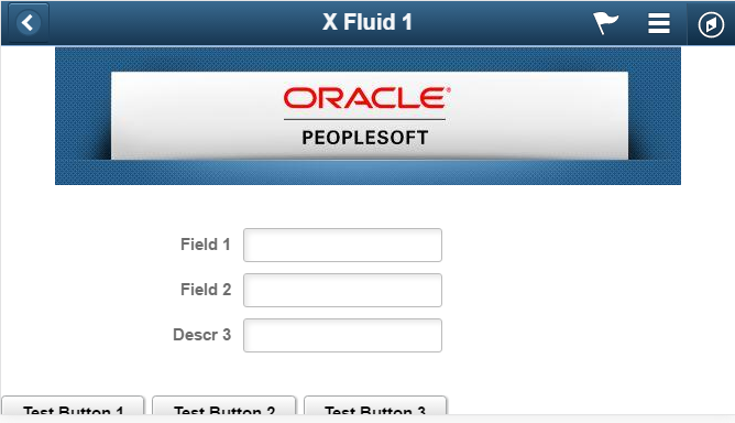
Here is what it looks like on my iPhone on landscape mode.  Looks good!


Now flip the phone to a portrait mode,  TA-DAH!! What happened with the logo.  DOH!!, it did not resize!  What's wrong!


Here is what I found.

The static image by default is using a stylesheet class called ps-staticimg.  However, the default PSSTYLDEF_FMODE.CSS does not have a reference of ps-staticimg classThat's the problem!


All you need to do if you are facing this problem is to add ps-staticimg class with an attribute max-width = 100% yourself;   How do I do that?  The simplest way is to add an HTML area to the top of your fluid page and add the CSS style class in it.


That's what you need.  Now let's test the page on the iPhone again on Portrait Mode.

Wait for it...Ah! That looks better!


Now you have a simple trick how to get your image to work correctly on your fluid page.

Happy Coding!


Monday, October 10, 2016

HELP! My Custom Fluid Page NOT Rendering Correctly On My Phone

While PeopleSoft fluid or generally known as "Responsive Design" may be new to some but not to others, I thought I would share a little simple trick to get your custom fluid page to render correctly on a small form factor device, such as smart phone.

Building a fluid page needs a little bit of getting used to, but by far it is still a lot easier than building a responsive design web page from scratch. Thanks to PeopleTools for this handy tool, we can now build a "responsive design" page in minutes not hours.

After you built a "Hello World" fluid page from scratch, tested it on the browser, and everything looked good initially, you would think "WOW, I did it and woohoo!".

Sorry to pop your bubble, I will say don't get excited too fast. You are not done testing. Remember! why are you building a fluid page? What devices that most of your users will access your fluid page from?

One of the main reasons why you start building more fluid pages than classic nowadays is because you heard this phrase a lot "Think Mobile First".

So back to your testing exercise, browser testing is not enough, you need to test this in your mobile phone for a small form factor. If it looks good, then you can congratulate yourself and move on.

How do I know if it looks good or not? See my examples below:


The one on the left looks great and this is what you are hoping to see on your mobile phone too.

So, you start asking yourself, WHY?

Two screenshots below were captured from two fluid page source code. One on the left is good, one on the right is NOT.


Here is a solution for you. Go to the app designer and add these two lines of code in your page activate peoplecode.


Retest your new page now on your mobile phone. Congratulations! your page renders correctly.


Don't Forget...Think Mobile First!

Happy Coding...